A brand can change its photography every season and its campaigns every year, but its typography is usually present in everything: the website, the invoice, the packaging, the job advert, the error message. That constant presence makes typography one of the most powerful and most underestimated parts of a brand.
Typography in branding is often treated as a technical choice made after the logo is finished. In reality it shapes how a brand sounds before anyone has read a word, and it accumulates recognition faster than almost any other element simply because it appears so often.
Letterforms carry tone
People respond to typefaces in much the same way they respond to voices. They may not be able to name what they are hearing, but they form an impression immediately: formal or relaxed, precise or warm, traditional or contemporary.
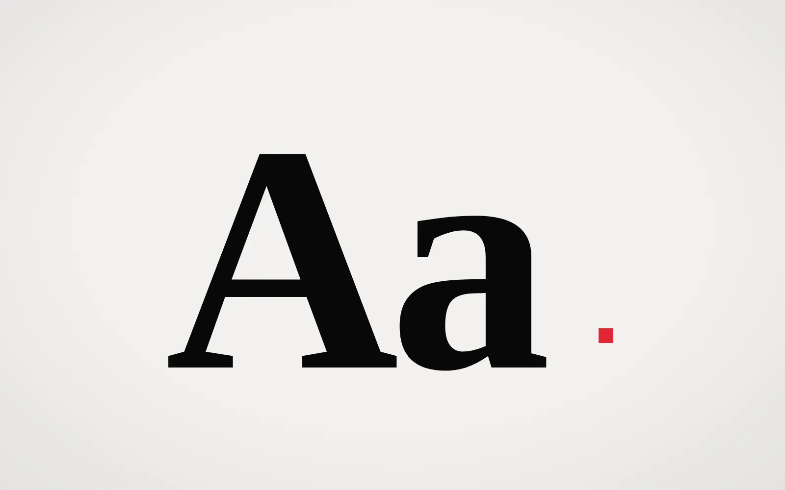
Those impressions come from the details of the letterforms. Contrast between thick and thin strokes tends to feel elegant or literary. Even, monolinear strokes feel more technical and direct. Open, round shapes feel friendly; condensed shapes feel efficient or urgent. Wide letterforms take up space and project confidence. Serifs connect to centuries of printed text, while geometric sans-serifs echo modernist design and engineering.
None of these associations is absolute. Context changes them, and a skilled designer can make a classical typeface feel radical or a geometric one feel warm. But the starting tone of a typeface is real, and choosing one without considering it is like casting an actor without listening to their voice.
Readability is part of the personality
A typeface that is difficult to read sends its own message, usually an unintended one. It suggests that the brand cares more about appearance than about the person reading. For most brands, that is the wrong impression.
Readability depends on more than the typeface. Size, line length, line spacing, contrast and the environment all play a part. A display face that looks striking in a headline may become tiring in a paragraph. A text face that reads beautifully on paper may struggle on a low-resolution screen. This is why most identities use more than one typeface, or a family with distinct display and text styles.
In digital products, readability is also an accessibility requirement. Sufficient contrast, adequate size and sensible spacing are not stylistic preferences. They determine whether some people can use the product at all. A brand that takes typography seriously takes those requirements seriously too.
Hierarchy is how a brand speaks
Typography does not only express personality through letterforms. It also expresses it through hierarchy: how a brand distinguishes the important from the secondary.
Some brands speak in large, confident headlines with very little supporting text. Others lead with quiet, detailed information. Some use dramatic contrast between levels; others keep everything close in size and rely on weight or spacing. These choices create a rhythm that readers learn to recognise. Over time, the way a brand sets its text becomes as distinctive as the typeface itself.
That rhythm is especially important in restrained identities. As we explain in why minimalist design is harder than it looks, when there are few visual elements, typographic hierarchy carries most of the structure, and small inconsistencies become very visible.
From typeface to type system
A single good typeface is not enough. A brand needs a type system: a set of decisions that allows many people to use typography consistently across every format.
What a type system defines
A useful type system usually covers:
- which typefaces are used, and for what purposes
- a scale of sizes for headlines, subheads, body and small text
- weights, line spacing and letter spacing for each level
- rules for capitalisation, alignment and punctuation
- behaviour on screens, including responsive sizes and fallback fonts
- what to do in languages and scripts the main typeface does not support
The last point is often overlooked. A brand that expands internationally may discover that its chosen typeface does not cover the characters it needs. Planning for that early avoids awkward substitutions later.
Practical constraints
Licensing, performance and availability also shape typographic choices. A beautiful typeface that cannot be licensed for the web, an app and broadcast may force teams to improvise. On websites, font files affect loading speed, so a carefully limited set of weights is better than a full family loaded by default. Variable fonts, which contain a range of weights or widths in one file, can help with both expression and performance when they are used thoughtfully.
Custom or licensed?
Some brands commission custom typefaces. The benefits can be significant: complete ownership, a unique voice and control over licensing. But custom type is a substantial investment and only pays off when it is used consistently for a long time.
For many brands, a well-chosen licensed typeface used with distinctive settings is the better option. Uniqueness can come from how the type is used (its scale, spacing, combination and layout) rather than from the letterforms alone. What matters most is that the choice is deliberate and that it is then applied with discipline.
Typography and recognition
Because it appears everywhere, typography is one of the fastest ways for a brand to become recognisable. Even when the logo is absent, a consistent typographic voice can signal who is speaking. This makes typography a strong candidate for a distinctive asset, as we discuss in what makes a brand memorable.
It also makes typography vulnerable to trends. Typefaces go in and out of fashion, and brands that follow those cycles closely tend to lose the recognition they have built. Our essay on why consistency matters more than trends looks at how to evolve an identity without discarding what people already know.
Questions worth asking
When choosing typography for a brand, a few questions are more useful than "Which one do we like?":
- What tone should the brand have, and does this typeface support it naturally?
- Will it work in every size and format we need, from a phone screen to signage?
- Can it be licensed for all the places it will appear?
- Does it distinguish us from the main competitors, or resemble them?
- Will we still be comfortable using it consistently in five years?
Conclusion
Typography is the voice a brand uses in every interaction. It sets tone through letterforms, builds clarity through hierarchy and earns recognition through consistent use. Treating it as an afterthought wastes one of the most reliable tools a brand has.
At REDDEFY, typographic decisions are made alongside positioning in our brand strategy work, and carried into the interfaces we design through UI/UX design, where readability and personality have to work together on every screen.