Digital brands move whether anyone designs that movement or not. Pages load, menus open, buttons respond, content scrolls into view. Each of these moments has a speed, a direction and a feeling. When nobody decides what they should be, a brand inherits the defaults of its software, and defaults have no personality.
Motion design for brands is the practice of making those moments deliberate. It covers everything from an animated logo to the way an interface responds to a tap. Done well, it makes a brand feel coherent and alive. Done badly, it slows people down and distracts them from what they came to do.
Motion as part of identity
Most brand guidelines describe how a brand looks when it is still: colours, typefaces, logo, layout. Far fewer describe how it moves. Yet on screens, motion is often the first thing people experience, before they have read anything.
A motion identity defines that behaviour. It typically covers the speed and character of movement, the way elements enter and leave, how the logo animates, how transitions connect one state to another, and how motion relates to sound. Like typography, it is most effective when it expresses the same personality as the rest of the brand. A brand positioned on precision might move with short, exact transitions. A brand built on calm might use slower, softer easing. A playful brand might allow overshoot and bounce.
These choices become recognisable over time. The rhythm with which a brand's content appears can be as distinctive as its colour, especially in digital environments where the logo is small and often absent.
The principles still apply
Much of what makes motion feel natural was articulated long before digital interfaces existed. In The Illusion of Life (1981), the Disney animators Frank Thomas and Ollie Johnston described twelve principles of animation that are still taught today. Several translate directly to brand and interface work.
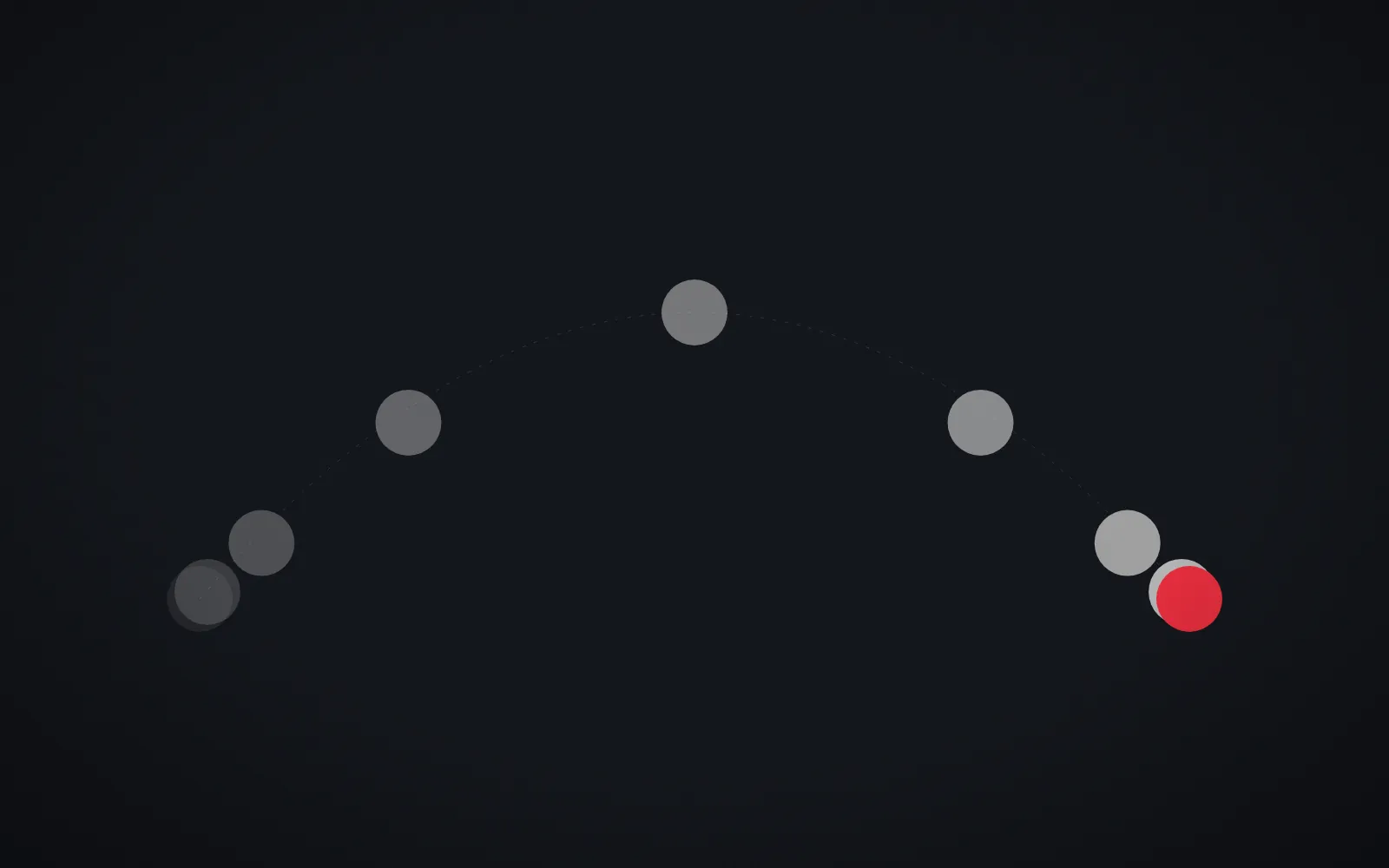
Easing. Objects in the physical world accelerate and decelerate rather than moving at constant speed. Motion with appropriate easing feels considered; linear motion often feels mechanical.
Timing. The duration of a movement communicates weight and importance. Small interface feedback should be quick; larger transitions can take a little longer.
Anticipation and follow-through. A slight preparation before a movement, or settling after it, makes motion easier to read and gives it character. In interfaces this is used sparingly, but even a subtle settle can make an interaction feel more physical.
Staging. Motion should direct attention to what matters. When several things move at once, nothing stands out.
These principles are not rules to apply everywhere. They are a vocabulary that helps teams discuss why one movement feels right and another does not.
Motion that explains
In digital experiences, motion's most important job is often functional. It helps people understand what is happening.
Continuity
When a card expands into a full page, or an image moves from a list into a detail view, motion shows that these are the same object in two states. This continuity helps people keep their place and understand the structure of a product without reading instructions.
Feedback
A button that responds when pressed, a form field that signals an error, a loading indicator that shows progress: these confirm that the system has registered an action. Without feedback, people repeat actions or assume something is broken.
Hierarchy and sequence
Staggered entrances can reveal content in the order it should be read. A subtle movement can draw attention to a new message without interrupting everything else. Used this way, motion organises information over time, much as layout organises it in space.
Motion that tells stories
Motion also gives brands narrative tools that static design lacks. Scroll-driven sequences can unfold an argument step by step. Short animations can explain a product more clearly than a paragraph. Transitions can create a sense of journey through a site.
The same discipline we describe in visual storytelling in advertising applies here: one clear idea, carefully paced, with nothing added simply because it is possible. A website where every element animates on scroll becomes tiring quickly. Motion is most memorable when it is reserved for the moments that deserve it.
When motion gets in the way
Motion has costs. Every animation takes time, and time is something users notice. A transition that delights on first view can feel slow on the twentieth. Interfaces used frequently need faster, quieter motion than marketing pages viewed once.
Performance matters too. Animations that cause stuttering or delay interaction damage the experience more than having no animation at all. In practice, animating transforms and opacity rather than layout properties, and keeping heavy effects off critical paths, helps motion stay smooth on modest devices.
Designing for reduced motion
For some people, motion is not only distracting but physically uncomfortable. Large movements, parallax and zooming effects can trigger dizziness or nausea in people with vestibular disorders. The W3C's accessibility guidelines address this in WCAG 2.1 success criterion 2.3.3, Animation from Interactions, which asks that non-essential motion triggered by interaction can be disabled. One established technique is to respect the prefers-reduced-motion setting that operating systems expose to browsers.
Designing for reduced motion should not mean delivering a broken experience. The best approach is to design a calm, complete version of every interaction, in which information still appears in the right order and transitions are replaced by simple fades or instant changes, rather than switching motion off and hoping nothing depends on it.
Building a motion system
To make motion consistent across a brand, it helps to treat it like any other part of the identity system:
- a small set of durations, from quick feedback to slower transitions
- a defined family of easing curves with clear uses
- patterns for common moments: entering, exiting, expanding, confirming
- rules for the logo and other brand assets in motion
- reduced-motion alternatives for every pattern
When these are defined once and shared by designers and developers, motion stops being a series of individual flourishes and becomes part of the brand's voice. Restraint is part of that voice; as we argue in why minimalist design is harder than it looks, removing what is not needed is a design decision in itself.
Conclusion
Motion design for brands is not decoration. It is how a digital brand behaves: how it responds, explains, guides and expresses its character over time. The most effective motion is purposeful, consistent and considerate of the people who experience it, including those who would rather it moved less.
At REDDEFY, motion is designed alongside interfaces in our UI/UX design work, engineered carefully in web development, and extended into film through video and photography.
Sources
- Frank Thomas and Ollie Johnston, The Illusion of Life: Disney Animation, 1981.
- W3C, Understanding Success Criterion 2.3.3: Animation from Interactions (opens in a new tab), WCAG 2.1.